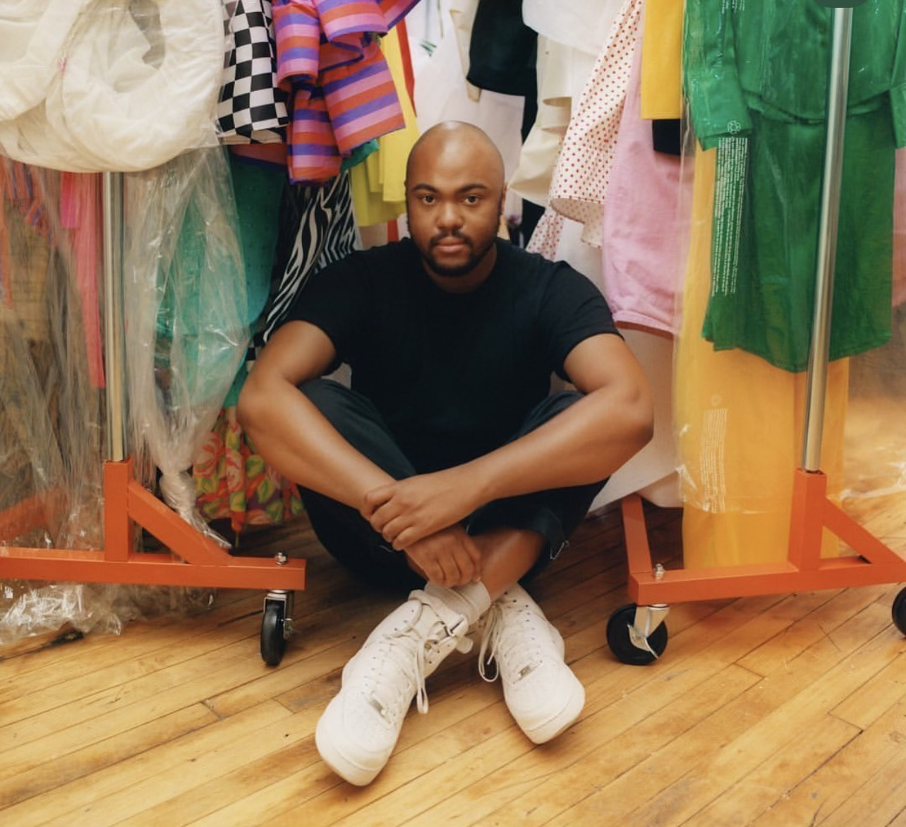
Christopher John Rogers: The Color Block King
Summer is a season meant to have fun with color. Sun rays beams off the brightest of hues that glisten on various skin tones. With that being said it is no surprise Christopher John Rogers takes the crown for summer’s guide to chic couture.
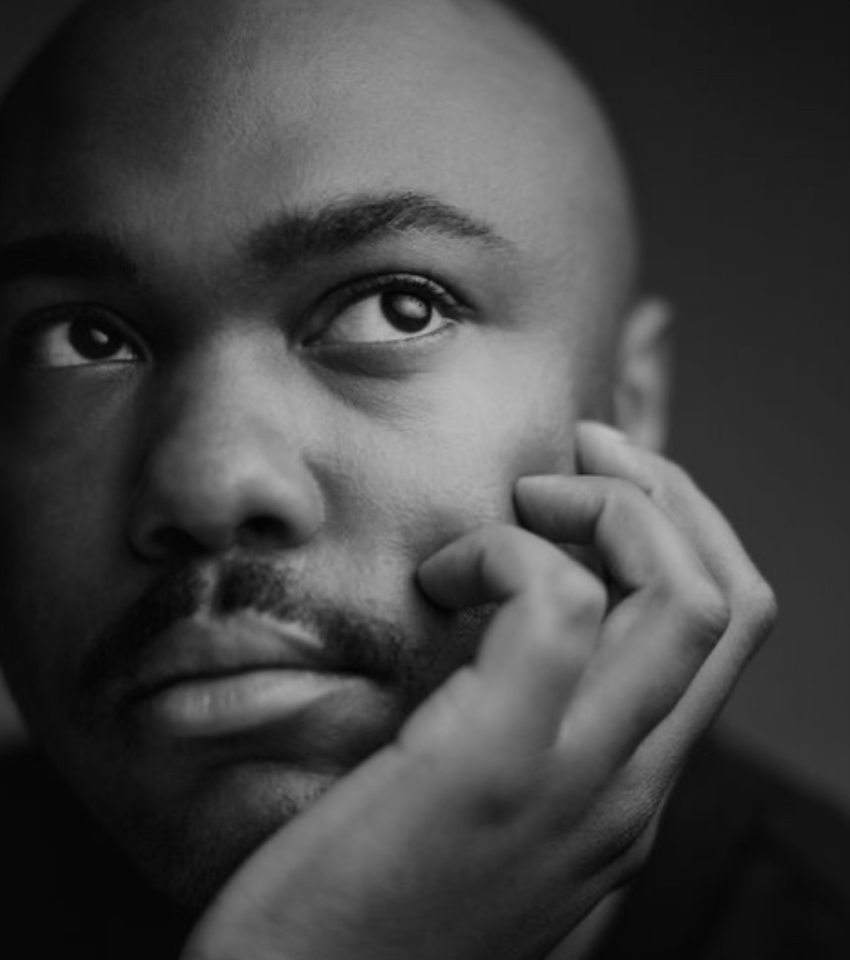
The Baton Rouge native always had an eye for fashion. He started sketching from an early age and sought inspiration from any object that evoked emotion. When Rogers was first starting out he could not land a job, was turned down from various designers, and was even told his collections were “too bright”.
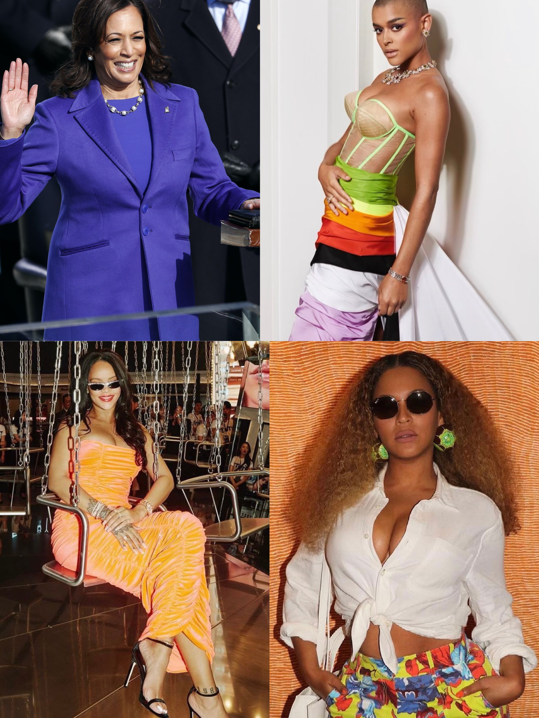
His designs were deemed too bright for some but just right for those who shared the same vision. Fast forward to today Rogers has received his flowers (and rightfully so) from the Council of Fashion Designers of America and Forbes 30 under 30. The industry buzzed when his work debuted on Inauguration Day in 2021 by Vice President Kamala Harris and on HBO’s Gossip Girl. He has even gone on to work with artists such as Beyoncé, Rihanna, Cardi B, and many more fashion icons.
Rogers experiments with contrast patterns, fabrics, and textiles. He is well known for his unique spin on color blocking. Versatility is his speciality and now it can be yours too. Dare to be as bold as CJR? Let us take a quick dive into color blocking 101.
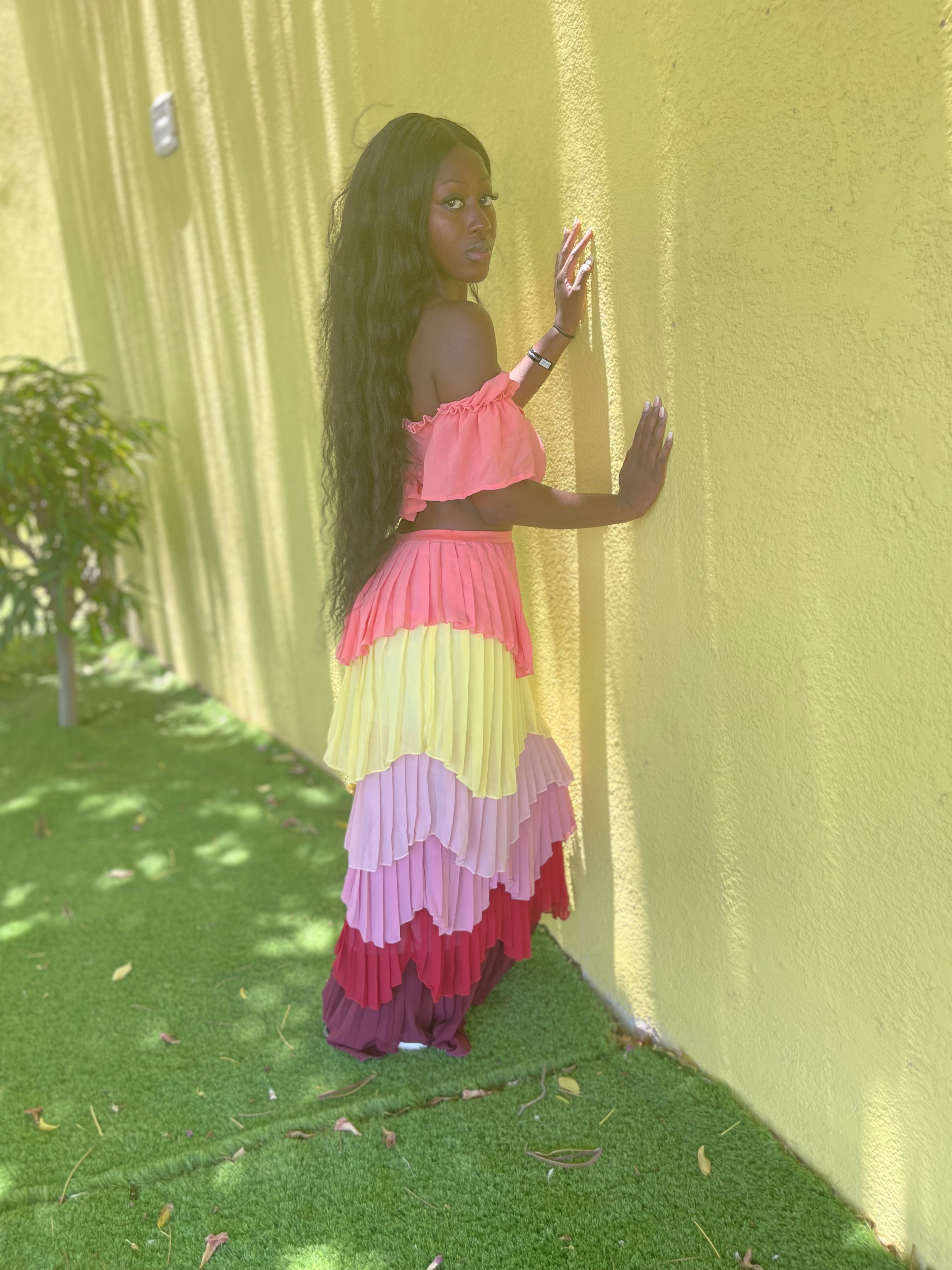
From the streets to strutting down the runway at New York Fashion Week, color blocking has made its debut in the fashion industry time and time again. The looks are only evolving and the combinations are only getting more conflicting. If you desire an expensive sense of style without even trying? Look no further. Color blocking is the way to go.
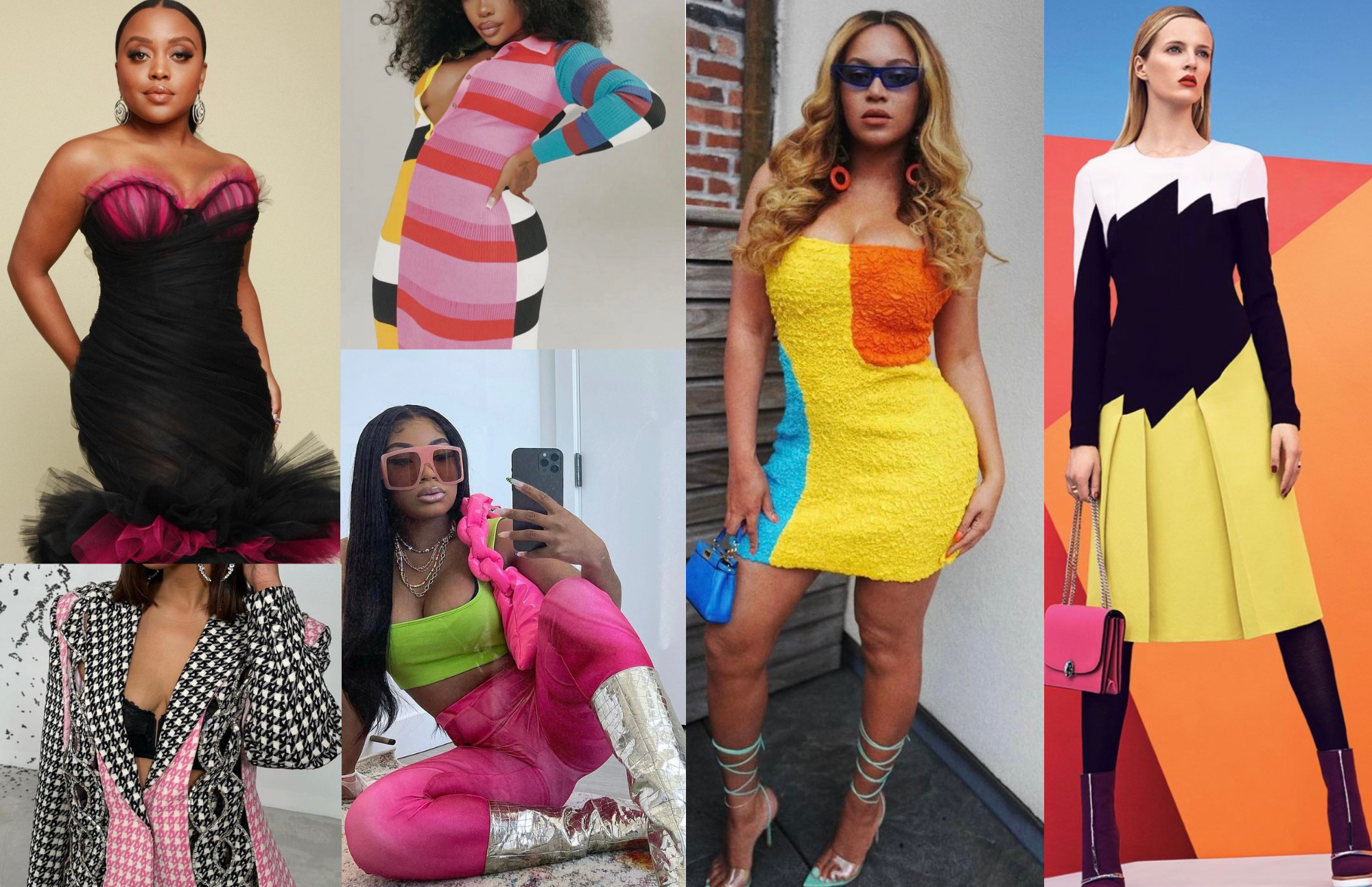
So, what exactly is color blocking you ask? Color blocking is wearing 2-3 (sometimes more) colors or patterns. Although color blocking is used as a creative expressive outlet for many, it can be a bit intimidating. If you are unsure of how to pull off this look first ask yourself what type of color blocking style you want to achieve. The color wheel will be your best friend. Use it as a guide and brainstorm what color(s) you want to pair together.
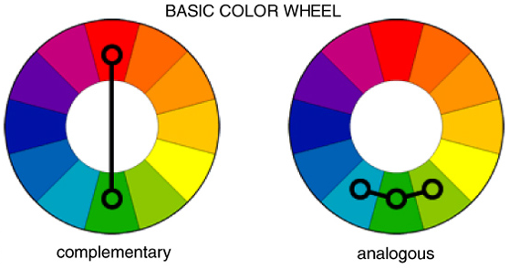
Start off simple. My three that never fail me just so happen to be the most consistent color block styles. If you're not quite the fan of mixing different colors, monochromatic is the way to go. You can achieve this look by choosing one color and/or incorporating different hues of the same color into your look. By doing this you get to maintain that sleek aura without going overboard.
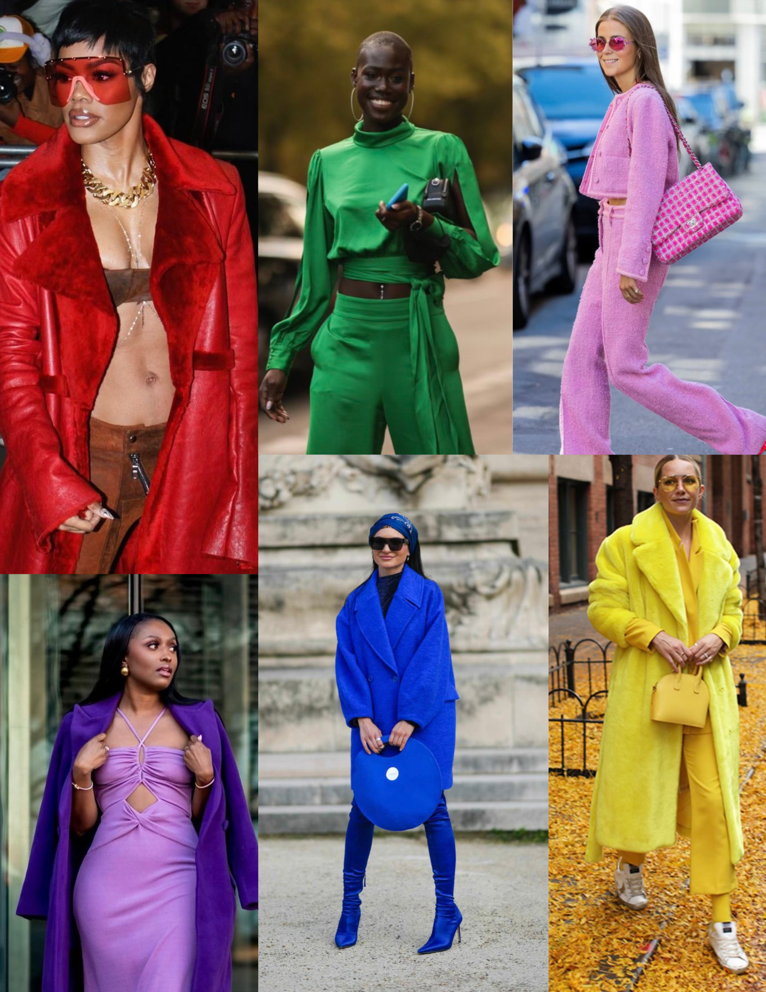
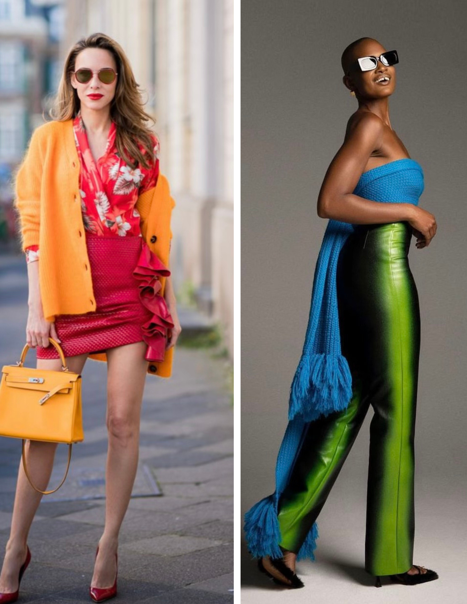
If you want to be the center of attention in any room you set foot in complementary, which just so happens to be my favorite scheme, will help you do just that. Take two colors on the wheel that are opposite of each other and just have fun! For example red and green, orange and purple, and yellow and blue all complement each other. Although they are on different sides of the spectrum they go together fabulously!
Adding a little pop of color has never hurt anybody! Instead of going full on complementary, try putting together pieces with colors that are right next to each other. For instance red and orange or blue and purple. Talk about aesthetically pleasing for the win!
A lot of the time we hold ourselves back by overthinking. Just do it! Eliminate “I could never wear that” from your vocabulary. If you feel good wearing it, you automatically look good. Whatever approach you decide to take remember these few tips, create some of your own rules, be confident, and most importantly have FUN!